Learning Activity – Applying for Jobs

95cdfeef.jpg

Description of the task: 

Publish a résumé and covering email as if you were applying to work at a real company.

Ideally you would also provide a portfolio website, but this will be completed over the next couple of weeks, so don’t worry about that now.

Result of the task:

This resume was created using Adobe InDesign. I focused on creating a simple and modern design, which represents me as a designer as well. I focused also on not adding too many elements and keeping it simple and clean. Here is the PDF-link:

Job Resumè


/Vibeke 

 LA – Building a Mobile-Friendly Website

photo-1518976055691-4936279bb254

Hi! This particular week before Easter, we are going to work with creating website mobile friendly. We continue to work with Screen Based Design, and will explore how to use WordPress to create mobile friendly websites as well. We will also look a bit into what to consider when applying for a job. Here is the description of the activity, as well as the final result. Since I am not used to working and setting up websites in WordPress, I had a few difficulties, even though I managed to create something and do my best.

Description of the task:

  1. 1. Write a detailed brief. (You may use a real client or a fictional one.)
  2. Use the information from the brief to build a wireframe for the website.
  3. 3. Choose a WordPress theme for the website.
  4. 4. Customise the WordPress theme to fulfil the specific needs of the client.
  5. Make sure that the site works on both desktop and mobile devices. (It does not have to work perfectly, but I want to see that you have considered it.)

Upload your brief, wireframe and website to your WordPress blog.


A detailed brief for a customer – Fictional one

First of all, I decided to use a fictional client, since I did not have time to find a real one. This is the detailed brief which was created for the client, in order to suit the needs of the client and create a suitable website. I decided to create a website for a fictional client, within interior design.

Name of Client/Company: Seagull Interior Design

Business and Concept:

Seagull Interior Design is a relatively new business, which works within interior design. It is located in the Southern part of Norway, near the coastline. The design company is focusing on creating simple and modern design, which also supports the environment. They focus on clean lines, simple architecture and design, inspired by the beautiful nature in Norway, such as the coastline, the sea, forest and the mountains. They work with natural and organic materials for their interior design, such as wood and clay.

Profile of the Client:

Seagull Interior Design brings you closer to the Norwegian nature. By offering design elements, décor, furniture created by organic and nature-friendly materials, they create a vision of a better and sustainable earth, without leaving out the aesthetics of the design. They are inspired by the raging sea and coastline, the cold breath of wind from the mountains, as well as the birds chirping the dark and mystical forests of Norway.

The main vision:

The main vision of the company is to create a suitable website to display their visions as well as the different products. The company needs to be presented in a suitable and inspiring way, to attract more potential customers. The website does also need to reflect their main vision, about a green and environmental friendly earth, and modernistic design.

The target audience:

The target audience will be all kind of people interested in green and sustainable design, and people interested in interior design of high quality, interested in architecture and simple and earth-friendly materials.

The Style Statement:

The website needs to be representing the company, to look aesthetically good, as well as simple and modern, to represent the modern theme of the company. It also needs to have a few green elements, to represent the environmental friendly design, which they are working for to achieve.

The goal:

The main goal of the website is to represent the company in a great way, to inspire people and attract potential customers to the site, and to display the design in a good and suitable way.

Wireframe:

High-tech wireframe

Link to website:   https://mobilefriendly.design.blog/

Have a nice Easter!


/Vibeke

LA – Building a Website From Start to Finish

Hi! This is the second learning activity of this week, where we learn about websites and business strategies. This time, our main task was about building our own website from skratch, to a functional website, coded using DreamWeaver. Below is the description, and the final result of the task. It was a really fun, as well as a bit challenging task to do, since it has been a while since I have worked with setting up a website.

Learning Activity – Building a Website From Start to Finish

  1. Write a detailed brief for your website.
  2. Create a wireframe according to the brief.
  3. Draw some sketches to plan your design.
  4. Build a working websites according to these specs.

It’s important for me to see that you can follow through on the entire process – from the brief to the completed website. Please explain why you make certain decisions. How do these decisions fit in with the business strategy?

Upload your brief, wireframe, sketches and link to your website to your WordPress blog. There’s quite a lot to do for this assignment, so it’s advisable to keep your website simple.

The result of the task:

Visit Peru mockup.jpg

Choice of hosting:

As for the choice of hosting, I decided to use domeneshop.no, which I always prefer to use, because of its user friendliness, and the fact that it is not too expensive.

Programming:

The website will be programmed using Adobe DreamWeaver. This is a great and

effective program to use, as it is easy and user-friendly. The website will be coded

using HTML and CSS. Later in the process I will use Adobe DreamWeaver in

combination with the program FileZilla, to upload the website to the hosting area.

Coding process – design/CSS:

The website will be, as mentioned, coded using mainly HTML for text and links,

and CSS for styling and design. It will be representing the beautiful land Peru, some info about traveling to Peru, and what Peru is known for. The website needs to have a user-friendly navigation bar, which will be parted in to two categories, “Home” and “Visit Peru”. The styling of the website will be focusing on having a modern, simple and user-friendly look. I focused on using modern fonts, and images of high quality, which needed to represent Peru in a good way. It needs to be inspiring, have a simple and clean navigation, and to be beautiful to look at.

Target market:

The target market will be all type of people, interested in traveling and in culture. The website is supposed to inspire, and attract tourists to Peru.

The wireframe and sketches:

IMG_0168 (5).JPG

Website link: https://www.vibeketveit.eu/

/Vibeke 

LA – Designing for Performance

chair.jpg

Hi! This current week we have continued to work with web design and business strategies. This includes some important repetition about core principles, like wireframes, fixed and fluid designs, browsers and coding. Here is the description as well as the final result of the task:

Learning Activity – Designing for Performance              (3 hours)
Surf the web and find 5 examples of websites that have been coded and designed for performance. 

5 Examples of websites that have been coded and designed for performance:

  1. https://www.netflix.com/no/
  2. https://www.bing.com/
  3. https://www.wikipedia.org/
  4. https://www.apple.com/
  5. https://www.behance.net/

All of these websites are built differently, but they all have in common that they look modern, clean and are simple to use and navigate on. The simple and efficient design makes the websites user-friendly and more effective.  It also does not distract the viewer from the main content. Designing for performance requires a commitment to maximize the necessities and strip out superfluous luxuries. A more practical approach towards design is needed, where each element has a tangible and net-positive impact on the end result.

/Vibeke


LA- Coming Up With a Strategy

webdesign.png

Hi! This week we have been working with websites and business strategies. Why they are important, and in what ways they affect web design. This particular task was all about meeting up with a client/a business owner and ask him or her what she wants from a website. Here is the description of the task, as well as the final answer and document set up.

Description of the task:

  • Set up a meeting with a business owner and ask him/her what he/she would want from a website. Also ask him/her what the business strategy is and how the website would fit into it.
  • Then write a detailed document about this.
  • I would like you to use the information from this document and create a website architecture.
  • Now let’s focus on the web design strategy. Your document should justify all the major decisions you make – from the domain registration, hosting, design and target audience through to what you decide in terms of programming.
  • Please upload your document and website architecture to your WordPress blog.

The result of the task:


What is the client’s service/product?

The client is an experienced photographer, which mainly takes photos of nature and landscapes. The client are in need of a simplistic but effective looking website, which the main focus will be on displaying his work/portofolio, and a collection of prints which customers may buy.


What are their requirements?

The website needs to look simplistic and elegant, as well as having an easy navigation. It needs a simple navigation bar, sorted into different categories, such as about, portfolio, portraiture, biography, prints/shop, blog and contact information. The photos needs to be presented in a easily-navigated photo-gallery, as well as in a simple, professional and elegant way.


What is the website’s goal?

The goal of the website is to attract potential customers to the shop and to inspire people trough beautiful photography. To display the work of the photographer in a professional and neat way. It is also important to keep in mind that the website needs to have an easy navigation, and put the main focus on the photography itself.


How are you going to achieve this goal?

To achieve this particular goal, I will be designing the website in a clear and structured way. The website will be needing a navigation bar, with all the vital information the visitor of the website will need. The focus needs to be on the photography, which will be beautifully and neatly displayed through a simplistic gallery display. I will be creating a front-page slideshow to display the wok of the photographer, and lastly, work with neutral colors such as black, white and beige, to create an elegant and simplistic look. The focus and the colors needs to be presented trough the photography.


What is the design style that will be required?

First of all, the viewer is going to be shown a large slideshow on the frontpage. This slideshow will present the most important work of the photographer, in a positive and beautiful way. The menu itself, the navigation bar, needs to be easy to navigate with, and look simplistic. As for the colors, the colors needs to be neutral and stylistic looking. The use of typeface might be bold and modern, to display an elegant, professional and simplistic look.


What are your suggestions for marketing the site?

The website will be marketed on social media platforms, such as Facebook, Instagram, Twitter and on the blog of the photographer, which is also to be found on the website. It may also be located in the local newspaper and on other platforms.


Strategy:

The client have a wish to make a living out of his dream, and to promote his photos in a professional and simplistic way. In order to do that, I will be creating a modern, easily navigated website, which really catches the attention of the viewer, by including large and effective slideshows with a lot of colorful and high-quality photos, incorporated by simple lines, simplistic navigation and neutral and elegant colors.

Here is the document set-up for the website strategy as well as the website architecture. Click on the PDF to see the finished result. 

Website Strategy & Architecture


/Vibeke

Learning Activity – Creating a Brief

Front End Develop.jpg

Hi! This particular week we are working with Screen Based Design, as well as basic principles for creating and marketing websites. This task was about creating a detailed brief for a particular client. It should be professional, detailed and describe all of the elements that will be needed in order to put up a suitable website for the client. Here is the description as well as the final execution of the task:

I want you to take on a client. I then need you to have a meeting with your client and create a very detailed brief. This brief should contain all the information that will be needed to achieve the client’s requirements. The brief should be good enough to hand over to any design/programming team and get a great result.

Your brief should cover these sections:


What is the client’s service/product?

The client is a hairdresser, which runs her own salon here in Norway. She has a lot of loyal customers, and may offer professional hairdressing, haircare, styling, and a broad range of different styling products. She is currently in need of a website, to promote the different prices as well as the different haircare products.


What are their requirements?

The website needs to be easy to navigate on, and to look clean and modern, to reflect the look and overall style of the hair salon. It also needs to include all the vital information about the different prices as well as the variety of different hair products that the hair salon may offer. Lastly, the website also needs to catch the attention of the viewer, as well as promoting the salon in a good way, causing more customers to visit the salon and make it more appealing and popular.

What is the website’s goal?

The goal of the website is to promote the hair salon in a good way, as well as displaying different prices and hair products for the customers to buy. It should look clean and modern, as well as to have a easy navigation bar, so that the customers can easily navigate around the site and find what they are looking for.


How are you going to achieve this goal?

To achieve this goal, I will be going to create a clean and structured website, which has a easy navigation, and which reaches out to a lot of people. The website will need to have a simple navigation bar, which may guide the customers to find what they are looking for. To promote the salon in a good way, it will also need to have a lot of good quality images of the hair salon and the products, to inspire the future customers.


Build the website architecture (so we can see what sections will be needed)

In this particular case, I decided to create a wireframe structure with pen and paper, to display how the front-end interface will work out. This will display the navigation bar as well as the different topics and themes on the website, and how images and text will be organized, to create a modern and simple look.

Wireframe Structure.JPG

What is the design style that will be required?

The design and style of the website needs to be modern and simplistic looking. It does not need too many elements, as the elements may distract the viewer from the main content, which is the hair salon, the prices and the different products that are to be sold. It also needs to look inspiring, have a lot of clear and colorful photos, which displays the salon in a good and positive way. The choice of colors overall needs to be simple and clean, as for instace beige, light pink and white tones, together with black for the typography.

What are your suggestions for marketing the site?

The website may be marketed through social media, which is a great platform to reach a lot of people. These platforms might be Facebook, Instagram, Twitter and so on. It may also be marketed through the local newspaper, to engage customers that are not using the internet that much.

As for the second Learning Activity – Providing Your Own Hosting Service, I have already acquired a hosting service, trough Domeneshop.no. My domain name is  http://www.vibeketveit.eu/, which I will be using to put up websites on.

/Vibeke 


LA – Analysing the Use of Design Fundamentals

Hi! This week we continue on working with Design History and Styles, as well as the MA 04 Design History Website task. It has been interesting as well as fun working with these tasks, and this is the final learning activity for this week, about analyzing the use of design fundamentals. Here is the description of the task, as well as the complete answer:

Choose any one of the illustrations from the lesson «Design Drawing» and answer the following questions (when submitting your feedback – also provide the illustration you chose):

What fundamentals are used successfully? Describe in detail what you think is the most successful aspect of the illustration (remember to focus on the fundamentals.)

Fish.jpg

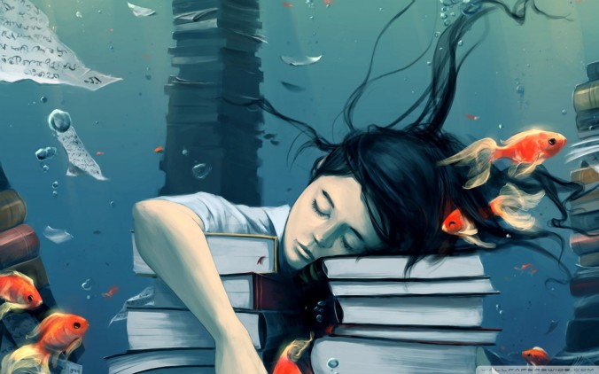
First of all, I decided to choose this image. I found it really interesting and unique, as it has beautiful colors and style. It appears to be drawn out of some sort of fantasy book for instance. I believe it is made by Tahier Variawa. As for the design fundamentals, I see a lot of important elements to discuss. Design Fundamentals are elements such as line, shape, form, texture, and balance, that are a part of almost everything we see and create. The most successful aspect of the illustration, might be the way every element is in balance. The shapes, forms and lines, are all beautifully floating around in the water, making the image look very realistic.

Furthermore, the artists use and choice of color is quite interesting. There has been used a lot of strong colors, such as bright orange on the goldfish, black hair, dark blue ocean, and these colors make a contrast to each other, making the image look more real and beautiful. The way the artist has combined strong colors and beautiful drawing, with realistic shapes and forms, is in my opinion the most successful aspect of the illustration, according to the Design Fundamentals as well. It looks a lot like a fantasy image, a magical place or something out of a fantasy book.

What style from the past is being used in a new way in this illustration? If no previous style is clearly apparent, does it use some form of pastiche? Why do you think this specific style or pastiche was used? Describe in detail whether you think it was used successfully or not.

For this case, I am not really sure, but I get a feeling that it might could be linked to the psychedelic art style. This is because this particular art form might be known for themes like fantastic, metaphysical and surrealistic subjects. This is in case a surrealistic subject, a girl sleeping on the books underwater.

It certainly catches the eye of the reader, and it looks interesting and creative. It also has bright and/or highly contrasting colors, such as bright orange and black hair. I think this particular style was used, to put the focus on the contrast in the image, between the girl, the sea and the fish, and to make the image look more realistic and interesting. It certainly is a successful effect, as I found the image quite beautiful and creative, by the use of colors, strokes and the way it is made.

Read again what Mondrian said about the expression of beauty or self. Which do you think played the dominant role in the execution of this illustration? Explain your thoughts.

Mondrian states that “although art is fundamentally everywhere and always the same, nevertheless two main human inclinations, diametrically opposed to each other, appear in its many and varied expressions. One aims at the direct creation of universal beauty, the other at the aesthetic expression of oneself, in other words, of that which one thinks and experiences.”

I think he means that it is individual what we as readers see as beauty in art. It is up to us to define what looks beautiful and unique, and we all experience and think differently. Even though art is everywhere, it might not look beautiful to everyone’s eyes. We either aim at the universal beauty, or the aesthetic expression of oneself. I do believe the last one plays the dominant role in this illustration. This image might not look appealing to everyone, as it up to ourselves, to find out how we think and express ourselves about it.

If you had to create this illustration, before starting the actual execution, what would your initial thoughts be on:

Colour (what would your approach to colour be?)

I would think about using strong and colorful colors, to catch the attention of the viewer and to make it seem recognizable and unique.

Line (what would you like to portray with the use of line?)

I would have used clean and simplistic lines, which does not distract the attention of the viewer, but look easy to look at and beautiful at the same time.

Composition (what would you wish to instil in the viewer by the use of composition alone?)

By the use of composition, I would create a modern and clean composition, with the main focus on the drawing in the middle, as in this case the girl with the books, and use strong and vibrant colors to make a unique and creative image.


/Vibeke

LA – Applying Philosophy to Design 2

Learning Activity – Applying Philosophy to Design 2

Skjermbilde

 Hi! This week we continue with working with Design history and styles. One of this weeks activities was about designing a book cover for a imaginative book, by choosing one of the styles that we have been working with this week. It was a fun and creative task, and I learned a lot more about the style period in which I chose to draw inspiration from as well. Here is the description of the task:

 Applying Philosophy to Design 2                                  

 Design a book cover for a thriller book called “The Fall of Imagination” by Sam Wan. This book does not exist and is open to your interpretation as to the subject matter.

  • It must be designed by clearly drawing inspiration from a previous design style.
  • The size of the cover must be A5 and it should include a front, spine and back.
  • The cover must contain a simple vector illustration that forms the basis of the design.
  • The cover must contain the title and the name of the author


The final result of the task:

The fall of imagination - Book Cover.jpg

First of all, I decided to find inspiration to this book cover, from the Swiss style, or the International Typographic Style. This particular style is well-known for its cleanness, readability, and objectivity. Each design done with International Typographic Style in mind begins with a mathematical grid, because a grid is the “most legible and harmonious means for structuring information.” Text is then applied, most often aligned flush left, ragged right. Fonts chosen for the text are sans serif, bold and modern looking.

Furthermore, I chose to add a few vector elements, as the task said, to form the basis of the design. As seen in a lot of Swiss Design, they include a few simplistic and modern looking geometrical elements, which catches the attention of the viewer. I decided to add some rectangular elements, in black and white, to maintain the simplicity of the overall design. Here are some of the inspiration:

bilde.jpg

Another element which is frequently seen in Swiss design, is the use of bright colors. I decided to use bright red for the typography, to make the text easy-readable and modern. I used a sans-serif font, and a black and white photo, to make a contrast between the typography and the other graphic elements. It was designed using Adobe InDesign, in a A5 format. I also decided to create a mock-up of the design, to make it look more realistic.

Here is the final design, in a PDF version: Swiss Design – The fall of imagination – Bookcover1


/Vibeke 

LA – Applying Philosophy to Design 1

Hi! This particular week we are continuing to work with graphic design history and styles, and how different styles and techniques may affect the viewer in different ways. I am also working with MA 04, which is about designing a Design History website. It has been a little while I have worked with Adobe Dreamweaver, so it was a lot of fun working with this program again, as it is one of my favorite programs.

Here is the description of the task: Applying Philosophy to Design 1

Design an A4 poster for a humanitarian cause you feel passionate about. For example, creating awareness and a call for action against human trafficking. You must apply pastiche to your design. Use a style of propaganda used during the Modernism era and create your own, unique design in a contemporary context.

  • Start by creating at least 5 thumbnails for your design. These thumbnails should be handed in with your assignment.
  • Write a rationale or explanation for your poster of at least 350 words. Why it is necessary to create awareness of the humanitarian cause?
  • Give an explanation for your creative execution, mention the use of colour and graphics as well as typography.
  • Give examples of the designs you used as inspiration and why it is applicable to your design.
  • Hand in your designs as PDF documents. You may use any medium for this. Hand in PDFs of your rationale and thumbnails as well.

 The final result of the task:

Save us.jpg

First of all, I decided to find a humanitarian cause/organization which I felt passionate about. I really care about the WWF organization, which is short for World Wildlife Fund – The leading organization in wildlife conservation and endangered species. WWF is an important organization which helps saving endangered animals and species, and which works directly with humanitarian organizations, governments and local communities to help institute better practices for disaster response.

It is quite important to create awareness around this cause, as it works for a better world, a better environment, suitable for the people that comes after us, the next generations, as well as saving our environment and the endangered species that lives on earth, as for instance lions, gorillas, some sea animals and so on.

As for applying pastiche to the design, I decided to focus on a propaganda poster, which made an impact on me. This was the “Revolution is now – Vote red” poster. This poster is a propaganda poster, and a part of a series of posters that were created for the M&Ms Elections in 2008.

image.jpg

There are a couple different parodies that one might see in this poster, the first example is Che Guevara, and the other being of the Soviet Union era propaganda look. I thought of Che because of the barrette that Red is wearing, it reminds me of some of the iconic photos that one sees of Che Guevara. The other is the Soviet Union feel with the massive amount of the color red.

As for the typography, I decided to use a bold-looking font, which I thought looked a bit similar to the font that are used in the propaganda poster. I decided, as for the colors, not to use bright red, but golden yellow, to better suit the black background in the poster. I decided to enlarge the typeface a bit, to make the poster look more recognizable and easy to read. I decided to put the main focus on the lion, and the text itself, to save them before it is too late.

I also decided to add some geometrical elements, as a geometrical shape around the poster, as also seen in the propaganda poster. I decided to make this poster a little bit more modern and simple, but with the same large headings and bold typography, to catch the attention of the viewer and make people create a change.

Here are the thumbnails created during the design process:

thumbnails

Here is the PDF: Poster – WWF

/Vibeke 

LA – Focusing on Design With a Conscience

Learning Activity – Focusing on Design With a Conscience

Sheppard Fairey

“Frank Shepard Fairey is an American contemporary graphic designer and illustrator who emerged from the skateboarding scene. He first became known for his ‘Andre the Giant Has a Posse’” (…OBEY…) (www.obeygiant.com) sticker campaign, in which he appropriated images from the comedic supermarket tabloid Weekly World News.

His work became more widely known in the 2008 U.S. presidential election, specifically his Barack Obama «Hope» poster.

The Institute of Contemporary Art in Boston calls him one of today’s best known and most influential street artists. His work is included in the collections at The Smithsonian, the Los Angeles County Museum of Art, the Museum of Modern Art in New York, the Museum of Contemporary Art in San Diego, the National Portrait Gallery in Washington, the Virginia Museum of Fine Arts in Richmond, and the Victoria and Albert Museum in London.

Analyse his poster for the 2008 U.S. Presidential Election and give your opinion on the use of style and its efficacy. Also critique the use of pastiche and typography.

Analyzing of the poster – by Frank Shepard Fairey

hope.png

First of all, this poster created by Frank Shepard Fairey, for the Presidential Election, really catches the attention of the viewer. The use of strong colors, bold typeface and strong context, makes the image striking and interesting to look at. As for the style of the poster, the use of flat-color design makes the design look more recognizable and unique. Fairey chose to illustrate the poster in only three colours as he believed the high contrast layers would yield a “streamlined, iconic image.”

As for the colors of the poster, they also recemble the colors of the Flag of The United States, red, white and blue, which creates a patriotic feeling and atmosphere. It would be beneficial to use during the Presidential Election, since the poster looks easily recognizable, it fronts Obama in a great way, it looks American and familiar. It looks reliable and professional.

As for the use of pastiche and typography, the designer seems to have been inspired by different styles and elements. The design itself, with the bright colorful elements and typography, seems to be inspired by Andy Warhol and he pop-art style. It looks both iconic and elegant in the same way. It also seems like the designer has been collecting some inspiration from the very famous poster of Che Guevara, created by the artist Jim Fitzpatrick.

comaprison.jpeg

It looks a lot the same according to colors, typography and the style itself. It might be giving some association back to the Propaganda posters, which was made in around 1920`s, with the Sovjet. Its simple and stylistic design, and bold and modern typography in sans-serif, makes the poster easily recognizable and iconic, which I believe was the main goal of the designer as well. It is also a colorful and elegant poster as well, which causes an instant recognition within the viewer. I do believe that the artist has been doing a great job, by creating a poster that would inspire a lot of people, just by using a striking and creative design, and he knew how to use it in a simple, but professional way.

/Vibeke